ShopDreamUp AI ArtDreamUp
Deviation Actions
Suggested Deviants
Suggested Collections
You Might Like…
Featured in Groups
Description
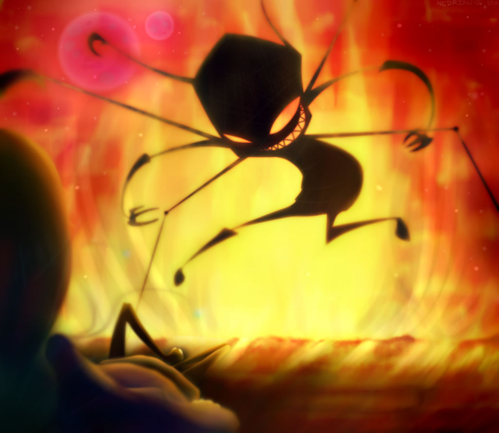
ok, so i was listening to [link] this morning and i had the idea of Ned and 0231 fighting eachother and this scene popped into my head,
AND.
I.
HAD.
TO.
DRAW.
IT!
 and i did.
 and it looks awesome!
listened to [link] while painting this
and encase anyone's interested, this is what my digital paintings look like when i draft them [link]
Ned/0231/art (C) me
Invader Zim (C) JV
[edit] after reading one of the critiques i thought it would be best to remove the sparks from Ned's PAK
AND.
I.
HAD.
TO.
DRAW.
IT!
listened to [link] while painting this
and encase anyone's interested, this is what my digital paintings look like when i draft them [link]
Ned/0231/art (C) me
Invader Zim (C) JV
[edit] after reading one of the critiques i thought it would be best to remove the sparks from Ned's PAK
Image size
3000x2600px 3.67 MB
© 2013 - 2024 Nedrian
Comments64
Join the community to add your comment. Already a deviant? Log In
"Self VS Self" by Nedrian is that of a horror scene with a viewpoint from that of the victim, ultimately making the feeling of helplessness one of the portrayed focuses from my perspective.
The elements of fear and horror are shown through a combination of the viewpoint, fire and the lighting effect that the fire has on the Irken attacker. It is this set of details that sets the mood and, therefore, make the picture quite appealing and eye-catching.
The anatomy of the Irken is unreal to the anatomy of Irkens in the actual show, with the longer arms with claws and the sharp teeth. However, Nedrian uses this to their advantage to make the Irken appeal much more horrifying. It's this use of creativity in how the Irken is portrayed that also impresses me. In fact, it reminds me much of styles I have seen in other macabre/horror artwork.
Though these elements are quite well done, I do have quite a few suggestions for improving this piece.
The first and foremost aspect of this that I didn't like was the clash of colors in the background and foreground. The majority of this piece is red and orange, which are strictly warm colors. However, the blue glow in the foreground is very cold, and it is inappropriate to the setting. Not only is is a color clash, but the lighting of the scene is clearly in the fire behind the Irken, not behind Ned. Therefore, that glow should be removed entirely.
The fire was, by all means, in good intention, and I do agree that it makes for embellishment to the mood. However, the brush(es) that Nedrian used for the fire seem to have made it too blurred and too smooth than fire actually is. The fire does not seem to be that far from the Irken and therefore shouldn't be that blurry.
What I find most helpful when creating fire is to look up stock photos such as this one: [link]
Another stock photo of fire, though close-up, can be found here: [link]
The look of fire differs with distance, so it's important to choose the look that best suits the perspective and distance in the artwork.
Lastly, there is the matter of the character on the ground; it took a little more than it should have to recognize that the character was Ned. This is because the character does not have definite lines; instead, Ned has highlights. Try bringing her out more and show a little more of her; in other words, scoot her a little farther away from the viewer.
To conclude everything, this is a great example of how mood can be established in a picture. Looking back at Nedrian's other works, this also clearly shows her fast improvement.

![Collab: ima glompz chuuu [finished]](https://images-wixmp-ed30a86b8c4ca887773594c2.wixmp.com/f/a1a85fe7-4550-4298-a099-1fbe114f907b/d54nzx0-d299e7fb-b24b-46ad-b7c2-55b7c7712f56.png/v1/crop/w_92,h_92,x_8,y_0,scl_0.1362962962963,q_70,strp/collab__ima_glompz_chuuu__finished__by_nedrian_d54nzx0-92s.jpg?token=eyJ0eXAiOiJKV1QiLCJhbGciOiJIUzI1NiJ9.eyJzdWIiOiJ1cm46YXBwOjdlMGQxODg5ODIyNjQzNzNhNWYwZDQxNWVhMGQyNmUwIiwiaXNzIjoidXJuOmFwcDo3ZTBkMTg4OTgyMjY0MzczYTVmMGQ0MTVlYTBkMjZlMCIsIm9iaiI6W1t7ImhlaWdodCI6Ijw9Njc1IiwicGF0aCI6IlwvZlwvYTFhODVmZTctNDU1MC00Mjk4LWEwOTktMWZiZTExNGY5MDdiXC9kNTRuengwLWQyOTllN2ZiLWIyNGItNDZhZC1iN2MyLTU1YjdjNzcxMmY1Ni5wbmciLCJ3aWR0aCI6Ijw9OTAwIn1dXSwiYXVkIjpbInVybjpzZXJ2aWNlOmltYWdlLm9wZXJhdGlvbnMiXX0.cOI22vBWtWFgzCpfTgCkbKkm1BTSnukA5JKq-3T_ldk)


