ShopDreamUp AI ArtDreamUp

Deviation Actions


Suggested Deviants


Suggested Collections


You Might Like…


Featured in Groups


Description
FFFFFFUUUUUUUUUU 2 FREAKING WEEEEEKKKKKSSSSSSSS
AHHHHHHHHHHHHHHHHHHHHHHHHHHHHHHHHHHHHHHHHHHHHHHHHHHHHHHHHHHHHHHHHHHHHHHHHHHHHH. .. . .. .
-------
ok, im done having my moment,
BUT JESUS DERP THIS WAS FUN TO DRAW!! (as you can tell XDD)
as you can (clearly) see i tried out a bunch of different techniques with this one, including a different lineart style
instead of using the linetool as always i opened a regular layer, used the brush tool, and finly sketched out the lineart in purple, then kept going over it (4 times) to give it a painting kind of effect. .. . .MISSION ACCOMPLISHED!
between this and Break of Dawn i prefer this one, i feel tinta could have come out better in break of dawn
SO THIS IS MAH BEST PIC YET!! >x333333 im vereh proud
(until just the other day i never drew markings and such before, and i seem to have an odd talent with drawing them :I never knew that until now. . . ) I MUST DRAW MORE!!
-----
this is a contest entery for ~LillyTheSeedrian's music theme contest (check it out here [link]), i chose the song [link] and drew these two since no one els (becides ruby's one she posted yesterday) had drawn these two at the time
I HOPE YOU LIKE IT.
BECAUSE.
I.
LOVE.
THIS.
TOO MUCH!! ;v;
Art (c) me
MLP (c) HASBRO
lemonade Sparkle (c) meg
Gracie (c) ruby
ENJOY! *dies*
[edit: messed with the grass a bit]
Image size
2500x4000px 6.31 MB
© 2013 - 2024 Nedrian
Comments82
Join the community to add your comment. Already a deviant? Log In
I'll mainly go with "What I think is wrong with this particular picture" here, so this might sound a tad more negative than it really is. I assure you it isn't, I always wish to help people improve. My way to give stars is also a tad more strict.
(I say this just because one really has to tread carefully in deviantart when it comes to critique.. I guess you understand.)
Right off the bat I have to say I like where this is going, idea is great, and I like the colors and rendering. There are just a few major and a couple of minor things that keep this from being an excellent piece.
First off the picture doesn't read well enough. I thought they were sitting in just some black haze on the sky until I zoomed in and noticed faint lines of grass.
You can keep the grass dark, but it'd help to give the ground level some purple mist or haze to separate the different areas of the picture. This also pops the characters out better and makes the whole composition readable at a glance. Also fullmoon does give quite a bit of light, so lightly illuminating the grass up or even creating a faint spotlight-like area around the characters would also add a tremendous amount of interest to the piece.
In any case you just have to make the bottom half of the image read better.
Your sky is really nice, but right now the light lonely "cloud" in the middle of the image throws me off. You could add more of that haze or remove that one to keep the sky more consistent. It's kinda just awkwardly there like "Uhh.. Hello.".
You could also get more impact by adding some more pronounced stars around upper half of the picture, making the sky more alive.
Theeen the thing you've already heard a couple of times.. Screwed anatomy.
No four-legged mammal has hind legs the way you've drawn them for both characters here. You should always take a reference picture of animal anatomy if you're not sure, even for cartoon characters. Front legs are a tad long too on both of them when compared to rest of their bodies.
Purple fellow's wing could be positioned farther towards the front legs, under the hair.
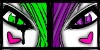
Heads are a very stylistic thing on ponies, and here they work great the way they are. Only thing I'd do is toning down the sitting fellow's blue eye highlights just a bit so they don't constantly take your attention away when you try to look at rest of the face.
The yellow tattoo markings are very beautifully rendered, but they should follow the curvature of the leg better. Right now they don't just curve enough and look like they're on a flat surface.
So yah, make the lower half of the image read better, correct the anatomy and make the sky just a liiitle bit more interesting and you'd have a pretty great piece.
Technique-wise your style works really well. The blending of cartoony characters with visible lineart to more textured and realistic overview does work, and I've seen some artists do incredible stuff with such styles.
You just have to think more about stuff outside the technique for now. Think more about what are you doing instead of how are you doing it.
Your potential in this piece is great, don't just let yourself be tackled by such silly errors! <img src="e.deviantart.net/emoticons/f/f…" width="15" height="15" alt="
On the bright side, these errors here are things that are extremely easy to fix on your skill level. <img src="e.deviantart.net/emoticons/s/s…" width="15" height="15" alt="